Layout
Typography
Per Clayton Notestine: Typography is the secret to good layout.
If the typefaces betray the idea, don't pair well, hamper reading, or sit disproportionately, your layout is dead.
If you're new, start with the body text. Try lots of versions. Iterate. Then (and only then) build a grid to fit.
See also wordmark, which helps you choose fonts for creative projects
Kerning
Turn a word upside down to better notice shapes and the spaces between them, not letters.
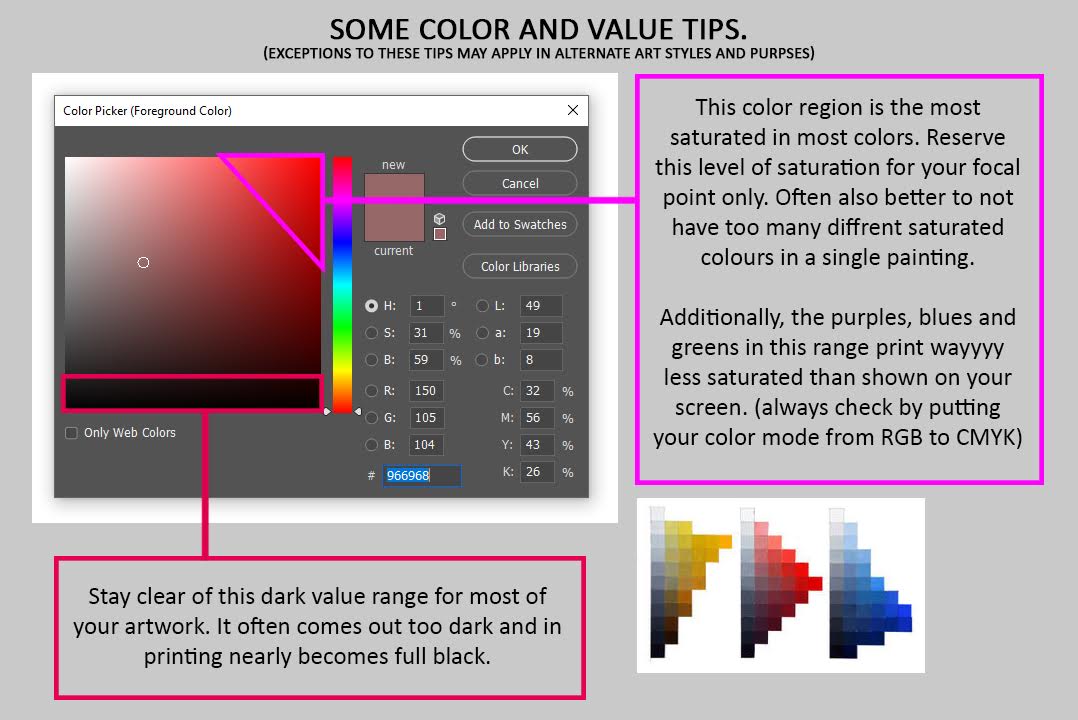
Printed book colors

Also
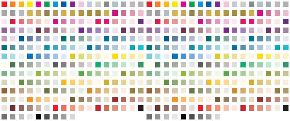
https://exeuntpress.itch.io/cmyk-color

This is a color palette file for Affinity Publisher that are safe for CMYK printing, per Mixam and PrintNinja.