VFX and Visual Effects in Games
Principles
Gameplay is king!
- Shape
- Contrast
- Color
- Timing
Gameplay is King
- Work with your designers, be friends with them.
- They can talk about "I deal 5 damage" can turn into an epic spell
- Clarity of purpose!
Shapes
- Sharp pointy things are inherently dangerous
- Can indicate AOE with different shapes
- e.g. leading AOE of rain of arrows
- Can be cracks or slashes over an area
Contrast and Focal Point
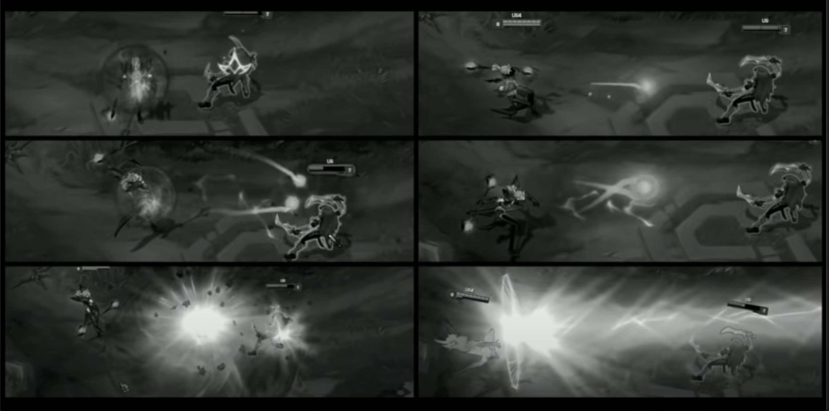
Players need to know what to focus on
Is there a summon happening, is there damage coming, does someone need healing, etc.
Shapes are helpful, but value variation is a quick way to showcase information.
Can also use a hierarchy.

If every ability was equally bright or shiny, it would be hard to tell what's important.
"If everything's important, nothing is".
==What can be ignored, what do I focus?
It's not one ability, it's everything all at once, so you need value balance.
High whites, low darks = high contrast, stands out.
Can transfer focus with a small thing and then hand off to another (e.g. A summons B at a distance)
Communicate clearly: what part of this needs to be dodged?
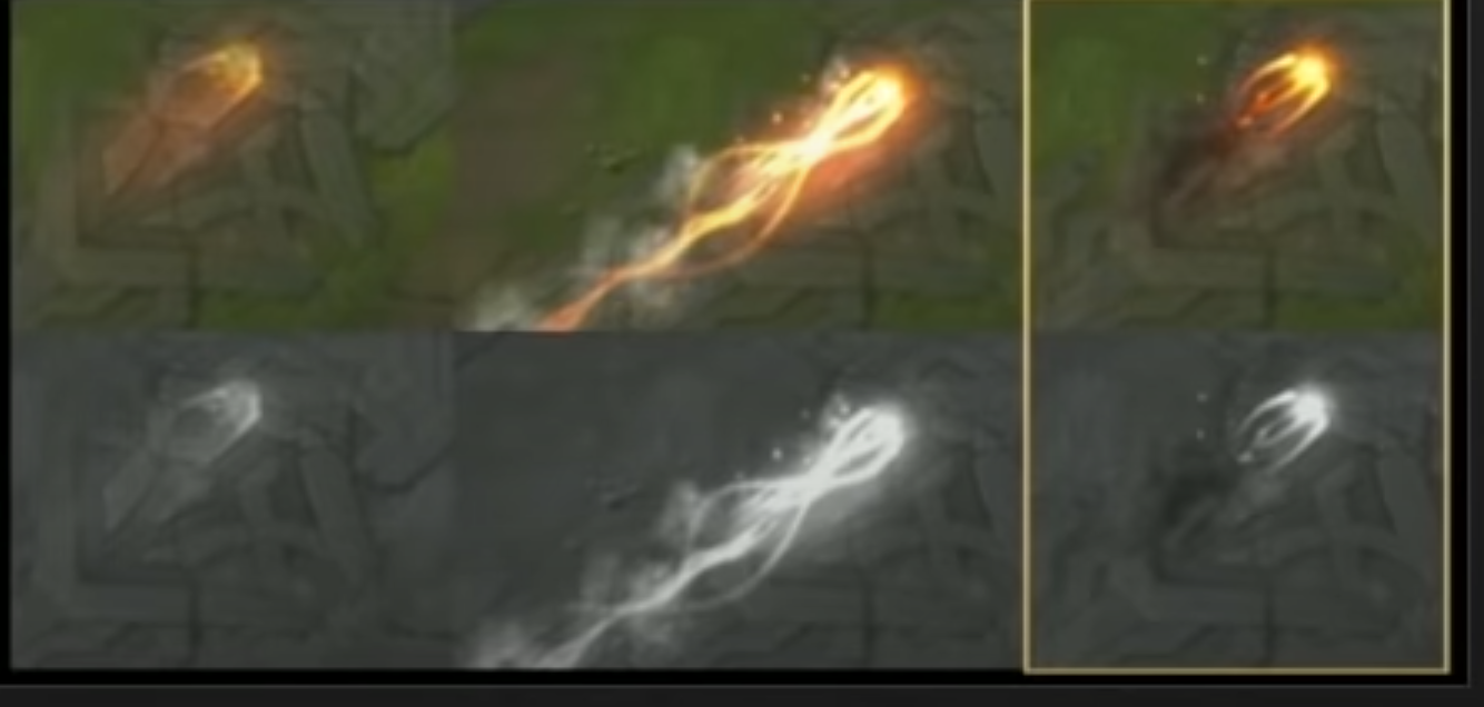
==Look at effects in grayscale, super helpful to see contrast. ==
Do this before adding color.

Color and Identity
HUGE topic
- Color theory
- Hues, saturation, values
- VFX on top of it
- Materials
- Duration
- Speed
- lifetime
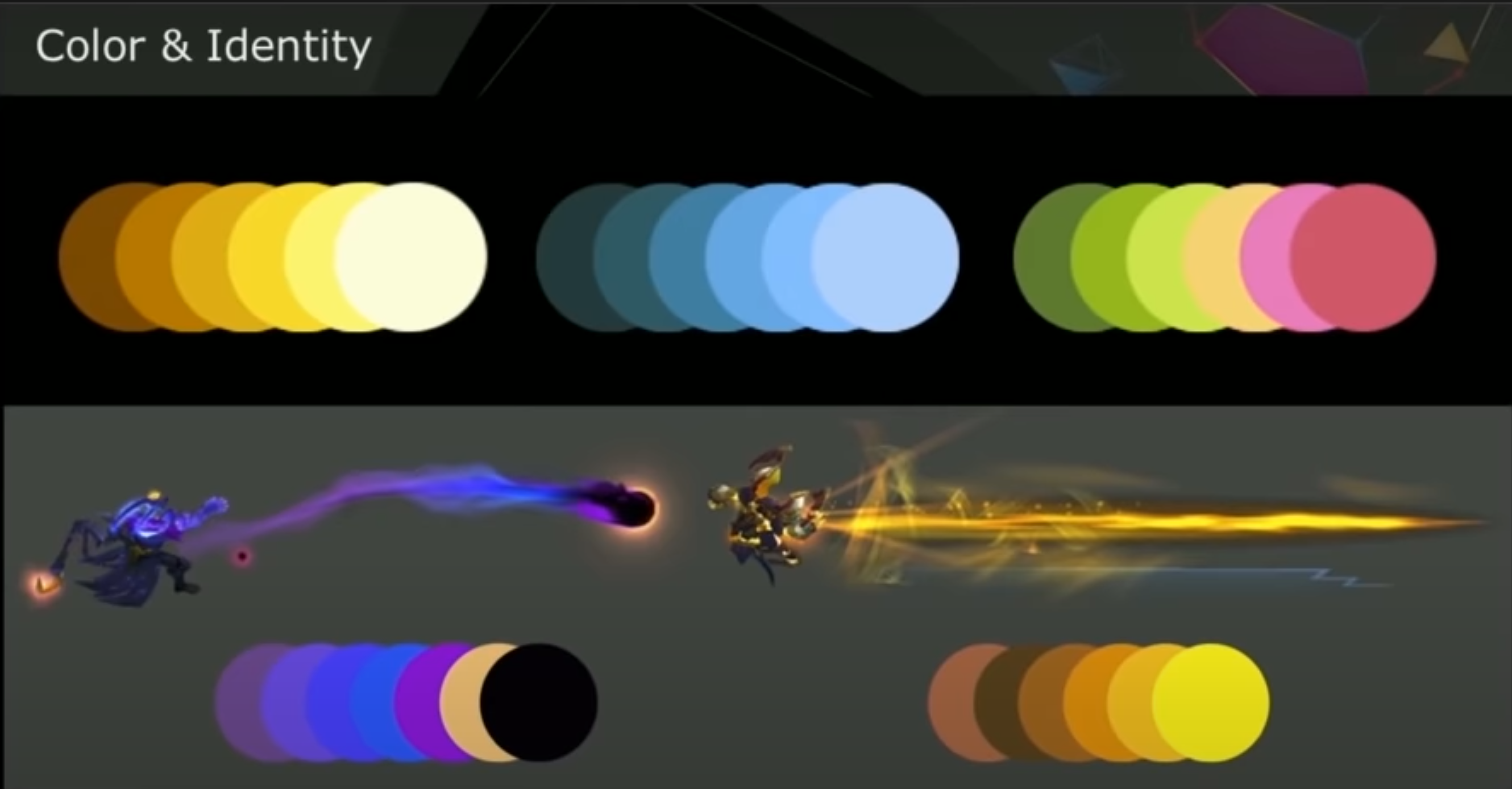
Often limited palettes.
Vary hues and colors:

This uses saturation contrast (purple) and hue contrast (yellow) to show focal points.
Consider Context
- People only have split second to do something
- Real world connections
- Take water turn it green: acid. Red: blood. Gray: oil
- Make sure that red healing potion is telegraphed so it doesn't come off as danger
What does color mean?
What does yellow mean?
Yellow + pink = holy
Yellow + saturated red = threatening
So mixing colors gives different personality
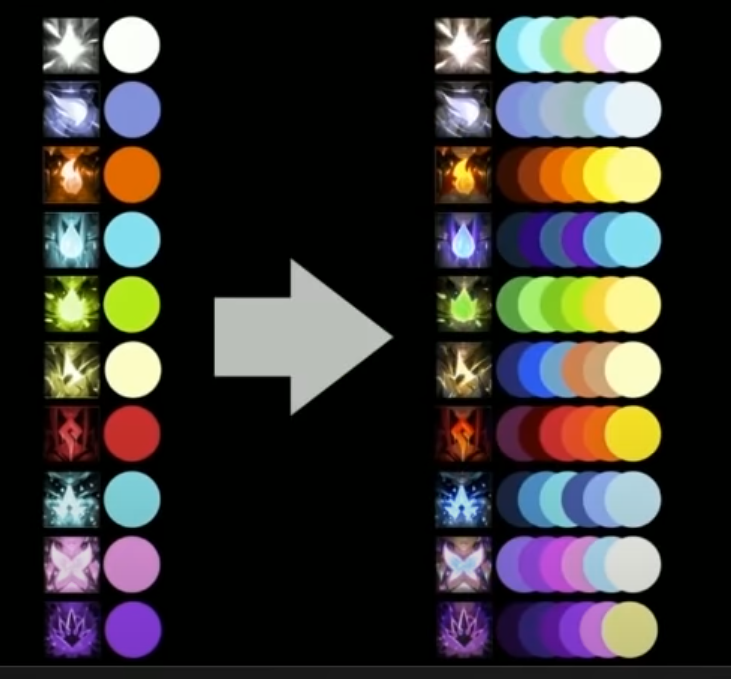
Some identity from hue variation: light and air ( first two) for example, but value is the same

So we add color depth:
pairing colors for more identity.
Hue and saturation variation

Water and ice common, but water has saturated purples, ice has desaturated cyans. (Fourth from top, third from bottom)
So we get schools of magic that have palates and you can identify at a glance with infinite palates.
Can also add team colors, or areas, or mood with subtle variations

36:43 is a bit about color variety and hue saturation and I'm not following any of it.
Colors from sources:

Timing and Threat Level
More a feeling or vibe than a science.
Hard to put into words
12 Principles of Animation
We're focusing on the most relevant 4.
- Squash + Stretch
- Blue squash makes it FEEL faster, easier to see.
- No squash makes the frame rate feel slower
- Anticipation
- Want to warn the player a moment before an explosion happens
- Slow In & Slow Out
- A burst at the beginning and a long slow fade out is powerful
- If you can't do anticipation, a fade out still adds satisfaction
- Secondary Action
- Like a trail
Intensity over time
How much is it demanding your attention over time?