The Art of Visual Notetaking
by Emily Mills
Visual notes are drawn by hand during or after an information session.
Clarify, visualize, organize info.
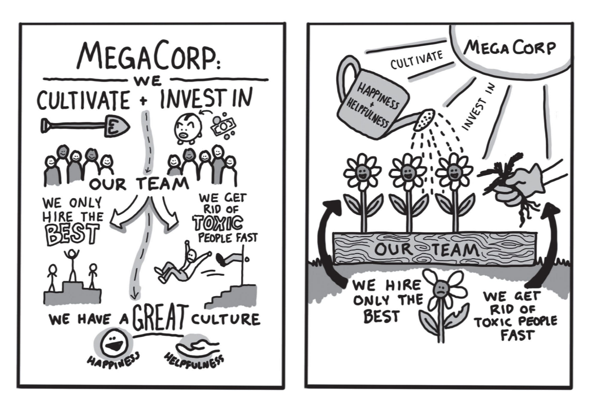
Illustrations paired with info should be directly related, else confusion is created (see also 2022 board game symbols "what do the icons mean"?)
Not just illustrations! They convey and highlight information, so the info has to come first!
❗ Effective visual notes always include written words. They work together
Illustrations help words not be overpowering. Make it interesting and memorable.
Not doodles! Done intentionally.
Types of Visual Notes
- Lecture based
- Experience based
Lecture based when one person is sharing. Should be taken in real-time.
Lots of facts and figures. Hard to grasp. Capture as much as possible, accurately.
Experience based is when you do something yourself (journal, travel, baking, etc.). Should be taken later.
Personal, easy to recall. Enjoy them now, record them later. Don't be distracted!
Tools don't make the artist, practice does.
Even ballpoint + legal pad can make effective notes!
Ask who the notes are for and how. Instragram prefers squares, for example.
Use pen! Embrace your mistakes. You'll learn from them more than a risk-free environment like pencil or digital.
Also easier to read!
Pen Considerations
- Smudgy? How long to dry?
- How does it work with your paper?
- How expensive is it to replace?
- Is it refillable?
- How easy is it to find? (my favorite pens are only sold by dollar general, which means I have to order online since there aren't any in Washington)
- Does the ink go bad over time?
- Does it need to "warm up" before the flow is good?
Marker pens are also nice!
but avoid permanent markers. Too bleedy, smelly, and off-color.
Other Supplies
- Ruler
- Plastic bag (organize + prevent pen explosions)
- Pencil case (as above)
- Clipboard
- Click eraser
- Book light or headlamp (for dark spaces)
- Smart phone (reference images, spelling)
- Business cards (hire me!)
- White out (only if paper is bright white!)
- Backpack
Go with the flow.
Consider your medium (whiteboard, easel, paper, etc.).
Get the main points and clarify them. Don't worry about perfection.
Prep Work
- Get the best seat
- making sure you can hear the speaker
- no distractions
- Like doorways
- Light changes
- Noise
- Talking / fidgeting people, or babies
- Air vents blowing your paper or making you cold
- Plus dress in layerrs!
- Next to sound booth is great!
- Get a schedule and plan ahead! (for like a conference)
One page of visual notes / 30 minutes of content
Listen well
- Hear. Near a speaker or the presenter
- Focus. Do not disturb mode, no distractions.
- Listen!
- Default is processing information (head to heart)
- Head to hand (active listening) is bypassing processing and just going straight from words to page. Very thorough.
She advocates for the latter approach.
If you're thinking anything (I don't agree, what's for lunch), your focus has wandered.
❗ Don't grab every word, just the main ideas and recurring themes.
Watch the speaker for cues of something important:
- Verbal
- 3 steps to solve this
- My first point
- If there's only one takeaway...
- To sum it all up...
- More than anything else...
- Repetition (esp bookending)
- Pauses
- Looking at the slide (if they're well made and curated)
- Gestures
- Speed, volume changes
Stories are sometimes unrelated, so use your best judgment. Pause before writing to see how relevant it si.
Actually Writing
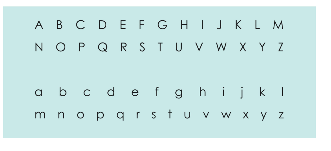
Practice a specific, classic alphabet instead of default handwriting.
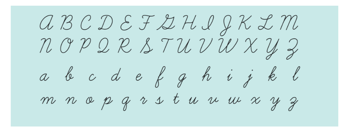
Same for cursive.
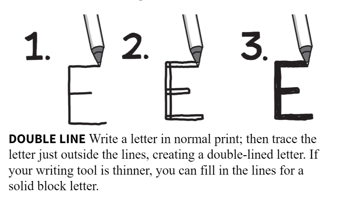
From there, add variety. Go to block letters.
- Trace over with thicker stroke
- Fast, not clean
- Block letters with outline (optional fill)
- Difficult
- Double line (optional fill)
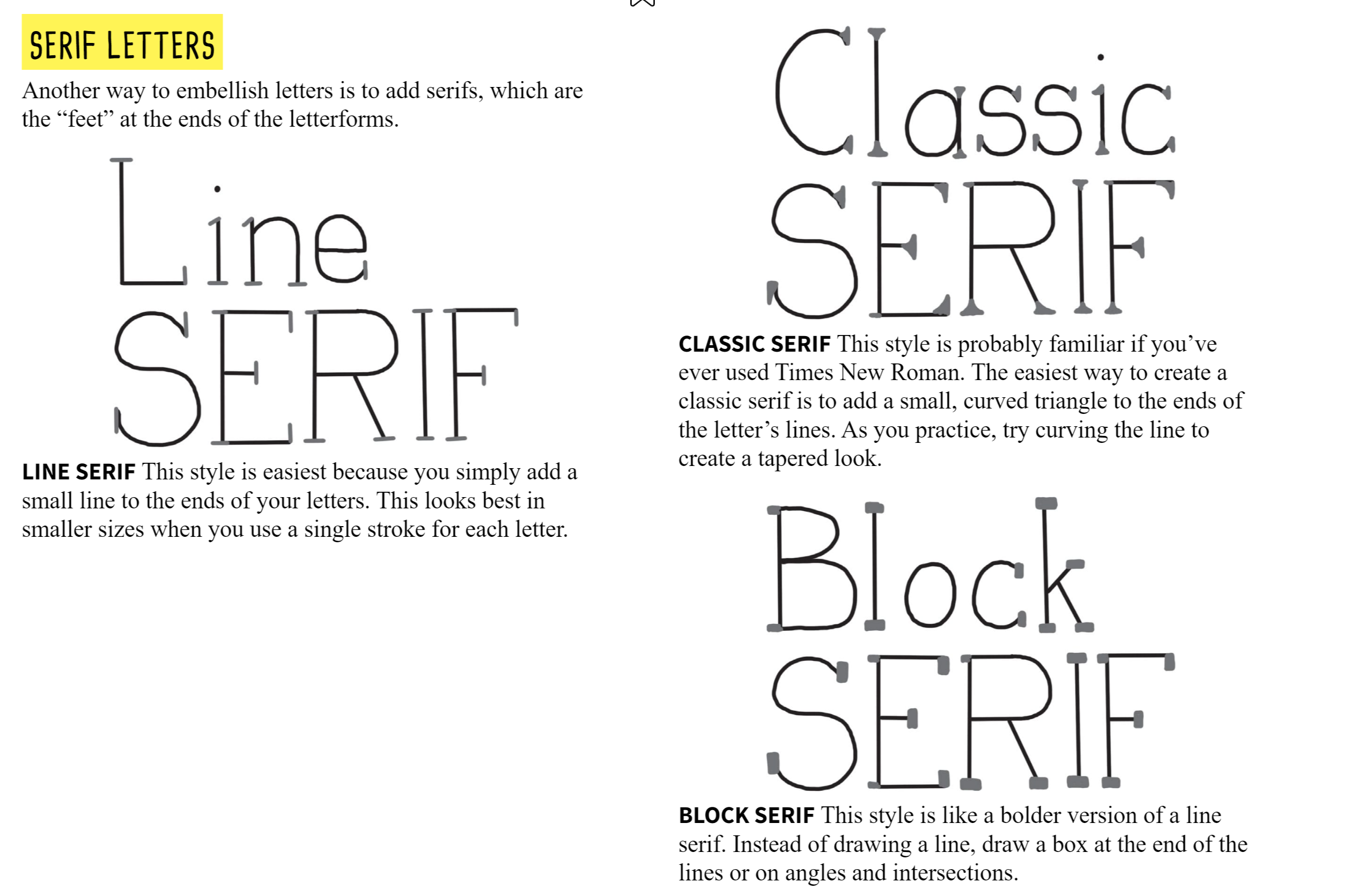
- Embellish with serifs (feet) on big letters
- Very easy!
- Looks best in small sizes where each letter is a single stroke
- Try classic, line, or block
Other Embellishments
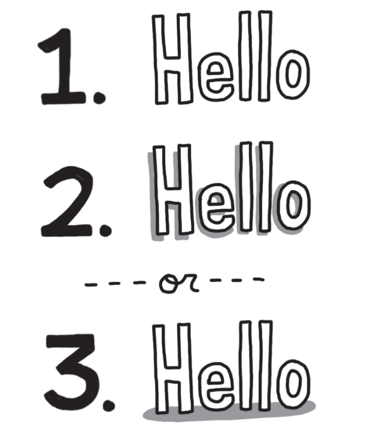
- Shadows
- Entire word
- Each letter
- Pick a side or two adjacent sides of each letter. Add gray or black mirror of the letter behind it OR a flat shadow along the baseline.
You can shade with
-
Stippling
- Add lots of dots where it's dark, few where it's light
-
Crosshatching
- Perpendicular overlapping lines, overlap close on dark, far on light
-
Solid fill
-
Scribble
- Like crosshatching, but loosey goosey
-
Countour
- Draw lines that follow the curve or shape of the object. Suggest depth.
-
Add texture to letters
- Best on big white empty letters
- an be dots, lines, or shapes, even in a gradient!
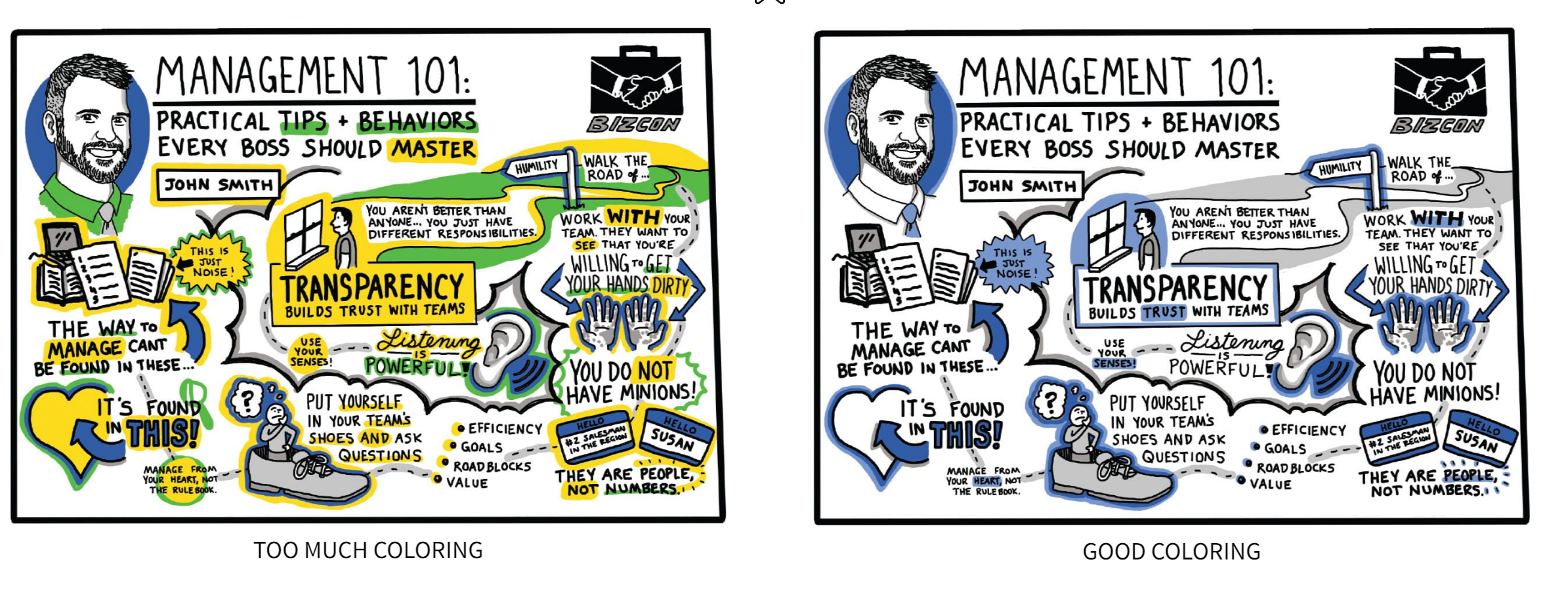
Use a small number of colors. Use light very rarely, there's no contrast!
- Start with a single color.
- Grow your color wheel (primary are red, blue, yellow)
- See also The Non-Designers Book of Design#Design With Color
- Complimentary, analogous colors are great when only using 2
- When you go to 3, use Triadic (3 colors on an equilateral triangle)
- Color should be a highlight, not a coloring book.
Can emphasize cursive, easiest way to is to add another line on one side of each letter.
Can use other nib styles for different weights, but now we're getting into calligraphy.
Hierarchy and Composition
Mix of large + small writing
Use 3 writing sizes: title (headline), subheading, and body.
Be consistent between the 3! More than 3 can be jumbling and confusing!
Heading can have serifs or be block. Used for central themes, ideas, words.
Subheading is smaller than h1 but bigger than body. Block or serif. Important phrases, quotes, action items.
Body is size of normal handwriting, unembellished. Majority of content.
Drawing
"I can't draw a stick figure!"
We can identify even simple images.
Accurate information > illustration
Recognizable > realistic
All drawings are 3 things:
1. Dot
2. Line
3. Shape
Combine these into anything!
Dot is just a single point. Use a lot for shading and texture, space them in a gradient for smooth transitions.
Line is a dot that extends.
Can be
- Curvy
- Crooked
- Straight
Shape is a line that is enclosed.
- Curvy
- Straight
- Solid (filled)
- Empty
Start with imagination. Look for possibilities in basic shapes, like cloud watching.
Google e.g. "Light bulb drawing clip art" for reference images. It's low quality, but easy to see the simplest form of an object.
Learn from others! Draw in groups and learn!
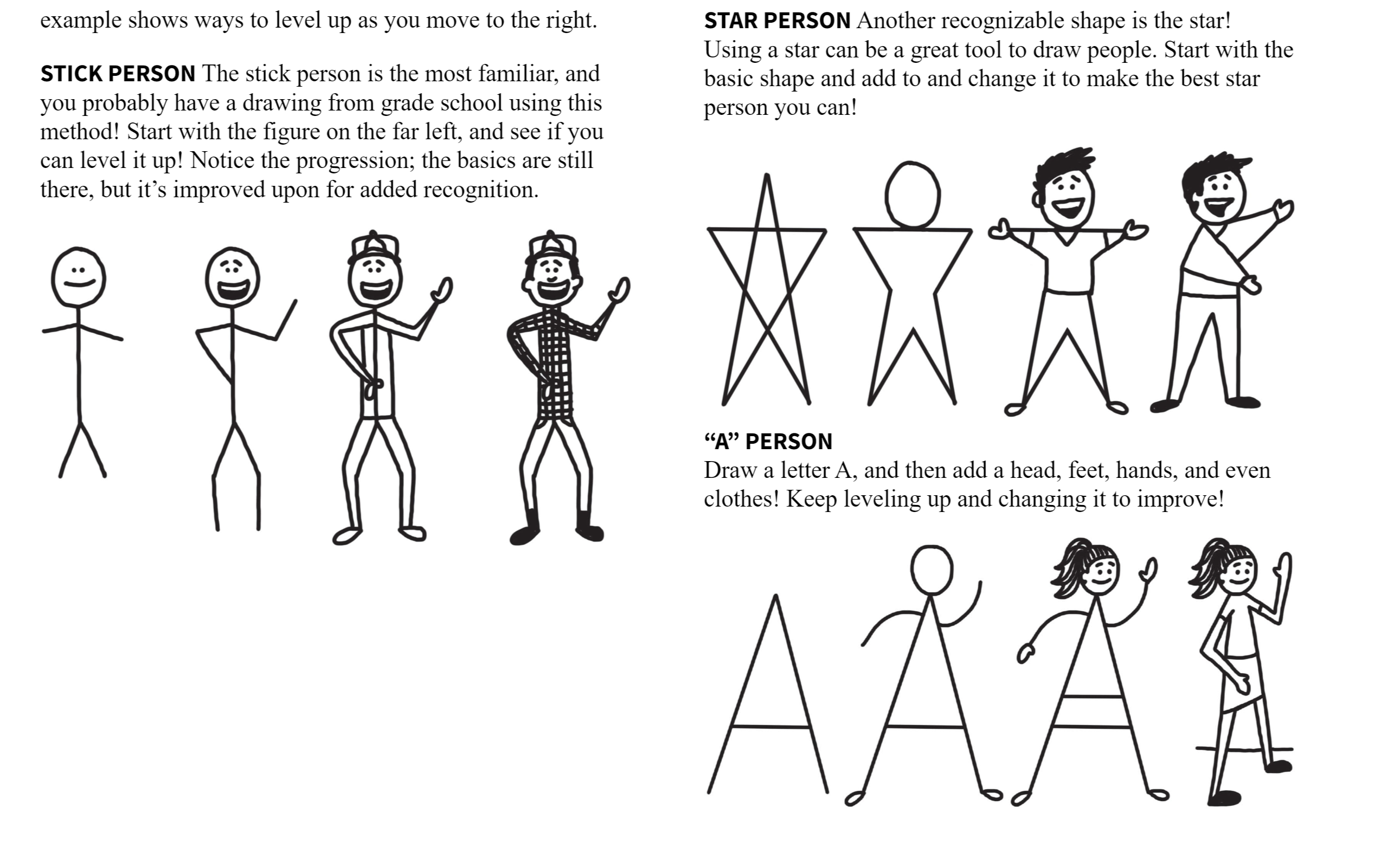
Level up a drawing
Start with basic then ask "is there anything I can add to improve this?"
Don't add for the sake of adding (sometimes the answer is no)
Add
- Dots, lines, or shapes
- Shading
- Details
- Context (who, what, where, when, how, why)
- Color
- Label or caption
- Dimension
Or - Ask a friend for tips
- Change an existing element
- Change the angle
❗ Simple and recognizable, not realistic.
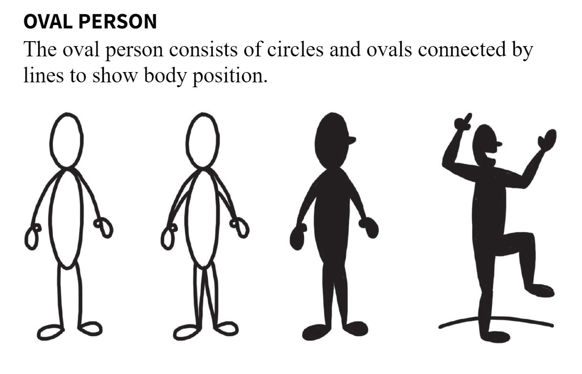
Don't need the whole body!
Faces are super easy to recognize and can get emotion across!
Don't worry about realism, go for clarity.
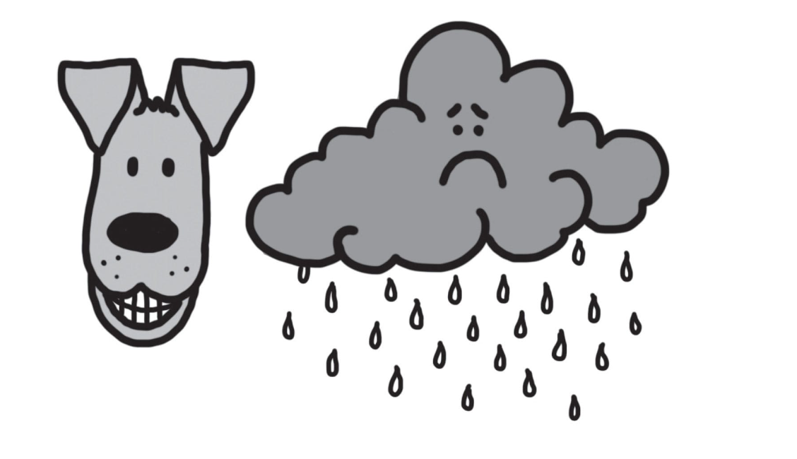
When drawing faces, vary
- Intensity of emotion
- Age
- Angle (side view?)
- Extras (tears, hearts, etc.)
- Use emoji for inspiration
Hands
Recognizable!
palm, fingers, thumb
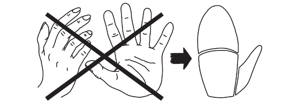
Stick hand is easy
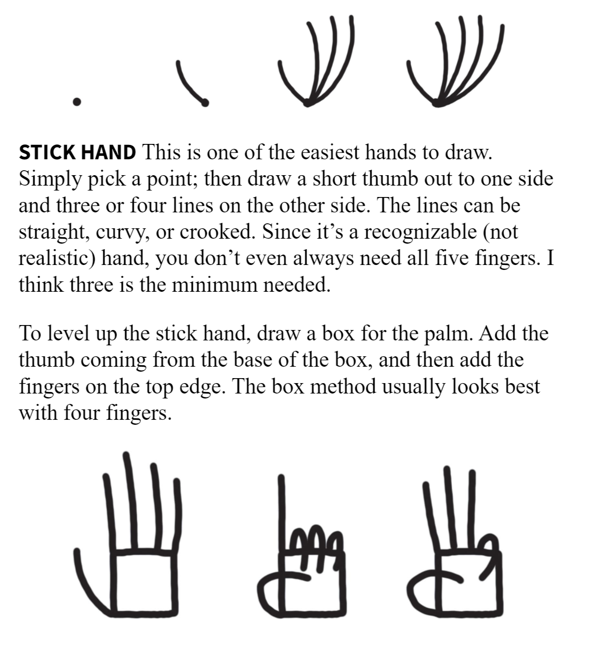
Box hand!
4 fingers, thumb from base of box.
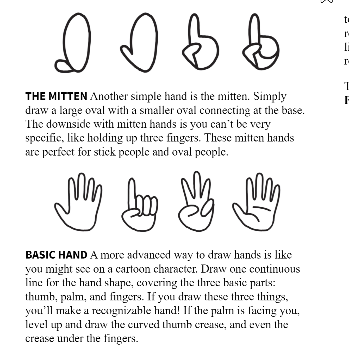
Level up the basic hand with fingers of different lengths, lines for palm lines / knuckles, button of fingers connecting on an arc, like a bulging square (not a straight line). This gets pretty advanced, skipping.
Cartoon Faces
Head shape
- Circle
- Horizontal oval
- Vertical oval
- Rounded rectangle
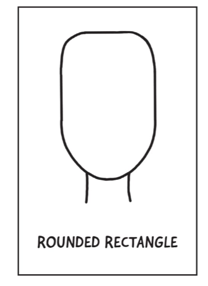
- Square
Experiment with changing width at one end, or adding a chin. Change up the neck lines (crooked, straight, curvy) but always parallel.
Eyes
Practice these! Lots of emotions!
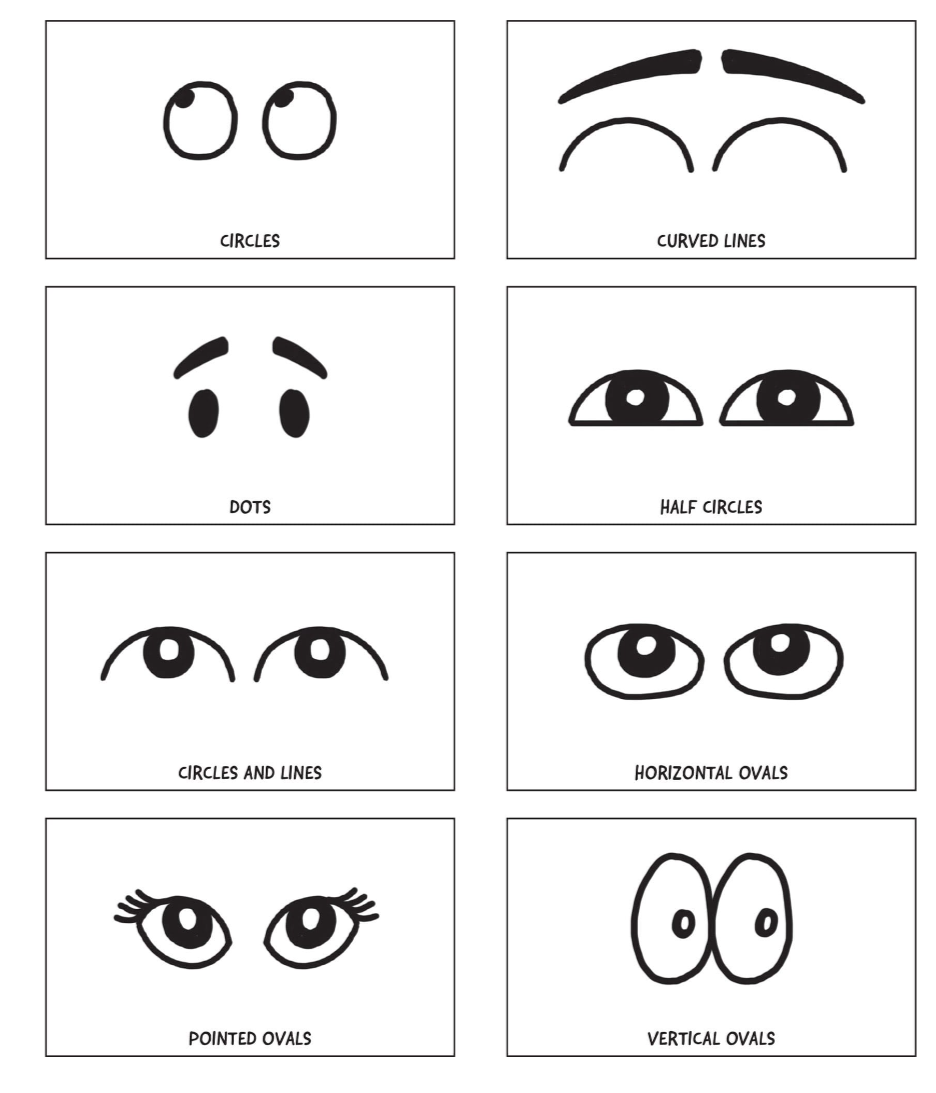
Elderly: add slight bags below, crows feet to the side, or relaxed droopy eyelids.
Add glasses, lashes lids, brows. Glasses can also replace eyes.
Toy with distance between eyes, size of eye, pupil, vertical placement, rotation.
Noses
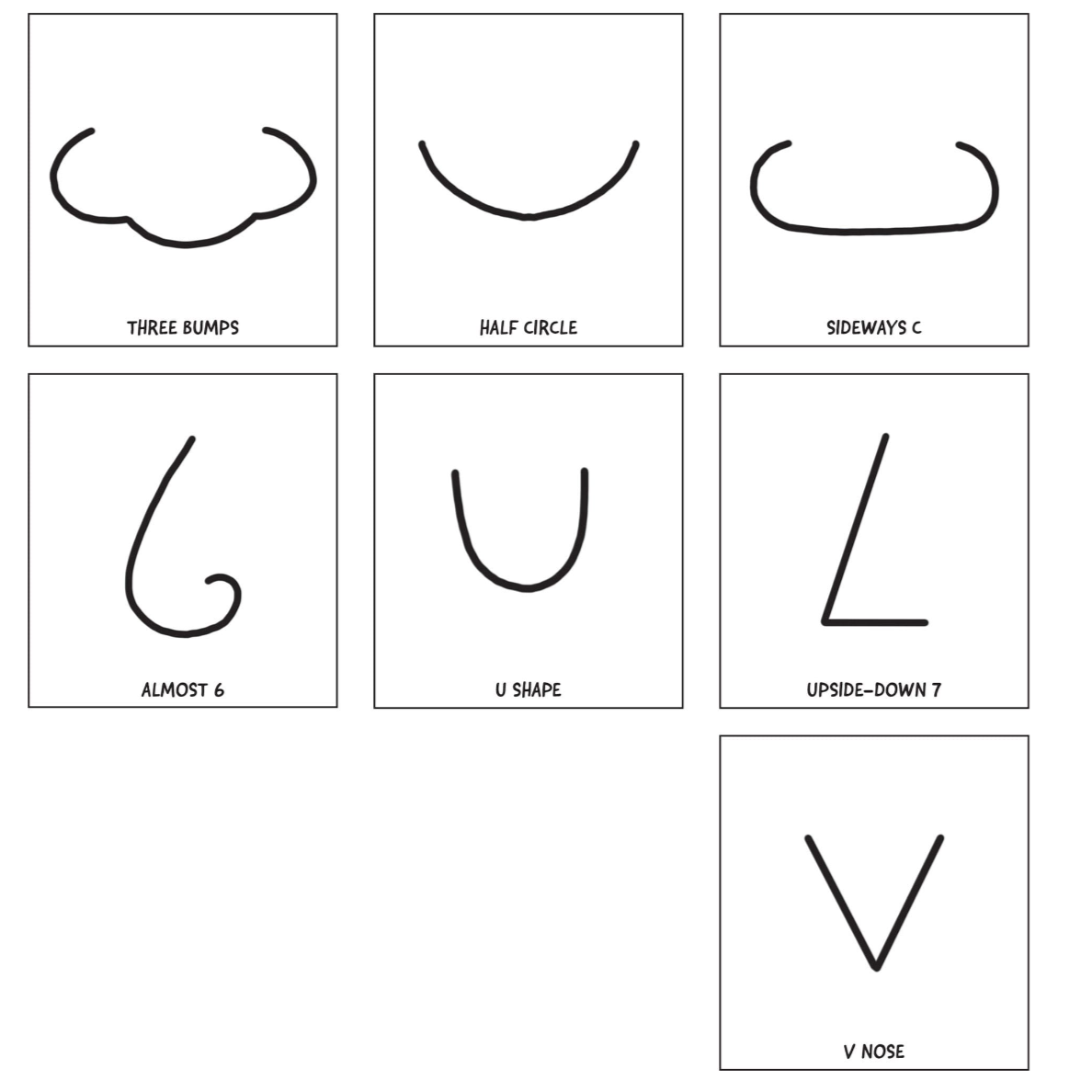
Don't add nostrils! It looks like a pig.
Mouths
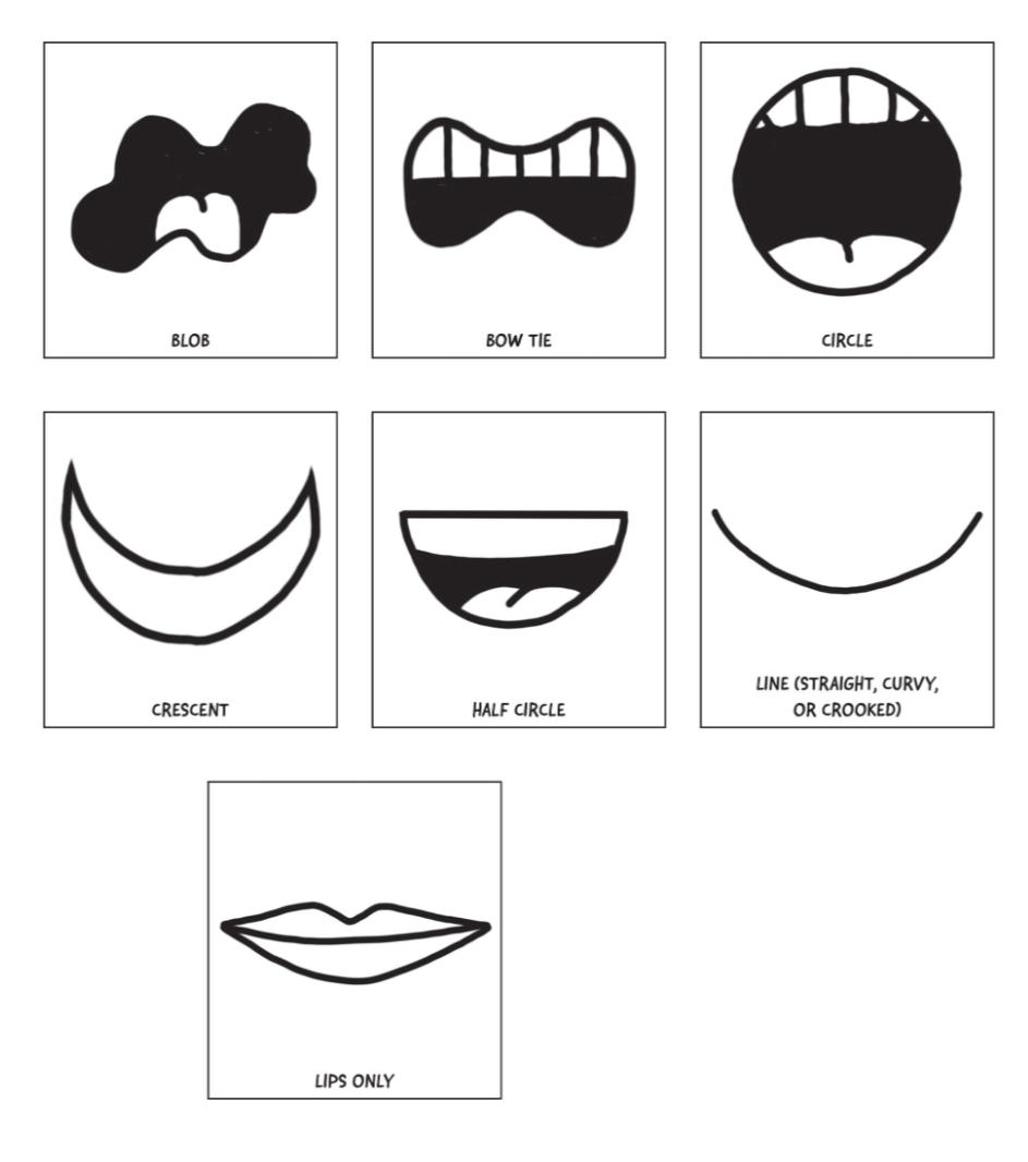
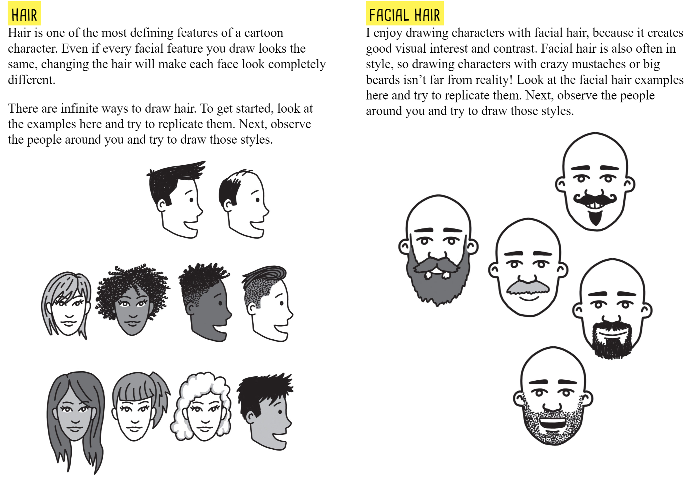
Add lips, tongue, facial hair, teeth
Elderly: lines from side of nose to the mouth, straight lines on side of mouth, wrinkle lines on lips (?)
Ears
Box, C shape, question mark, swirl
Front: just a shape
Side: some details but don't overcomplicate.
Can add earrings
Hair!
Most defining. Can completely change a character.
Visual Direction
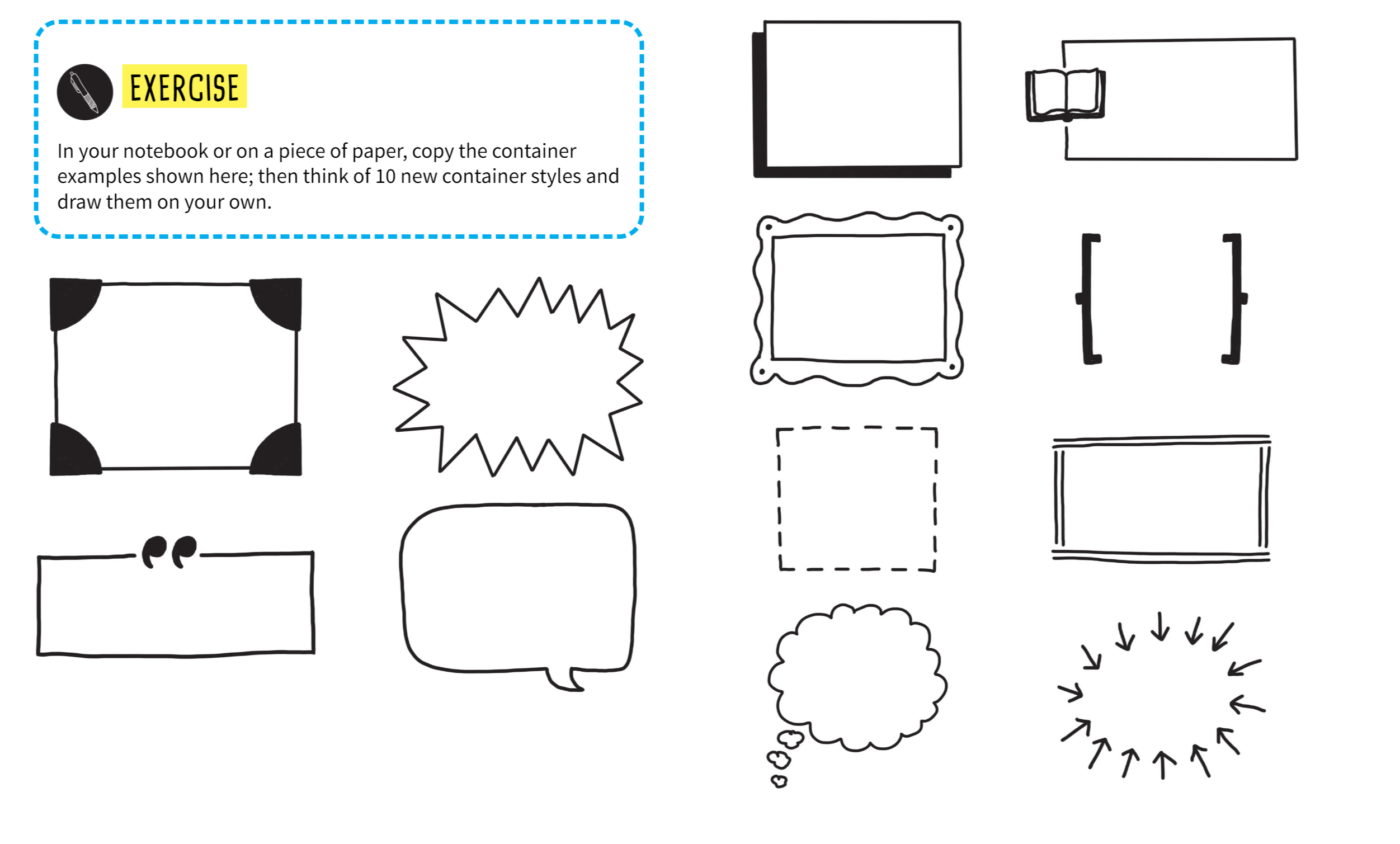
Use containers! They separate your content and can draw attention to big ideas.
Container styles:
Box, pull quotes, thought bubbles, brackets. AMYTHING!
Numbers! Very powerful
Don't write them down until the list is full, they can get lost if the speaker doesn't list them perfectly. Pencil hem in.
Arrows! Super clear to direct attention. Tons of styles! Including dashed or curved.
You can also guide with shapes, making shadows that show how to read a document.
Icons!
![]()
Can also use custom icons in an index for clarity.
Diagrams
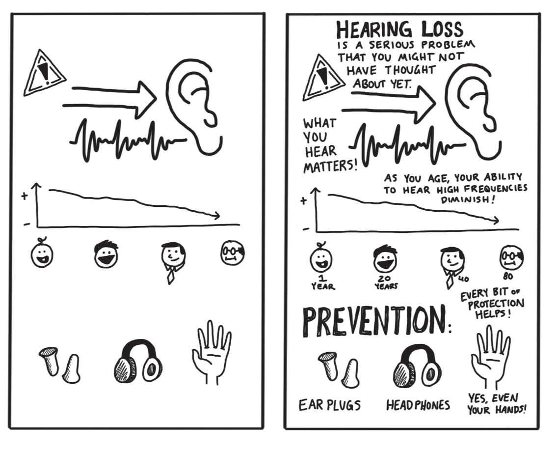
Generally, don't capture diagrams, capture their takeaways (sales are increasing)
5 types
- Flowchart / map
- List / category (groups)
- Graph (line, bar, scatter). Best if two axes: revenue over time
- Pie chart (its own category)
- Pictures (thermometer, progress up a mountain). Symbolic.
Experience based: diagrams good.
Lecture based: ignore diagrams that are brushed past. Photograph ones that they linger on. May not need details.
Pie charts are great for converting percents to visuals!
but really ask "what's the point of this diagram" and "how much detail do I need"
Build a library
As you do this, you'll repeat images. This is great!
The more you learn, the bigger your library grows.
Practice!
Recognizable over realistic.
Draw 10 things around you for practice. Then drill down by industry.
Don't just keep it in your head: keep a journal or index cards of the things in your library.
And update it for changes in style, fashion, technology.
Practice practice practice! Including variations.
Books, brains, keys, lightbulbs all good to know!
Picking a metaphor
Your first idea is usually best.
Metaphors help simplify complexity and aid in comprehension.
Use keywords and synonyms, but don't get distracted from the presentation!
Layout
Road map of your visual notes.
Starting out, go book style: top down, left right
Arrows and labels help direct attention!
Plan your time accordingly, can pencil out blocks before hand with time stamps.
That way you don't run out of room partway through
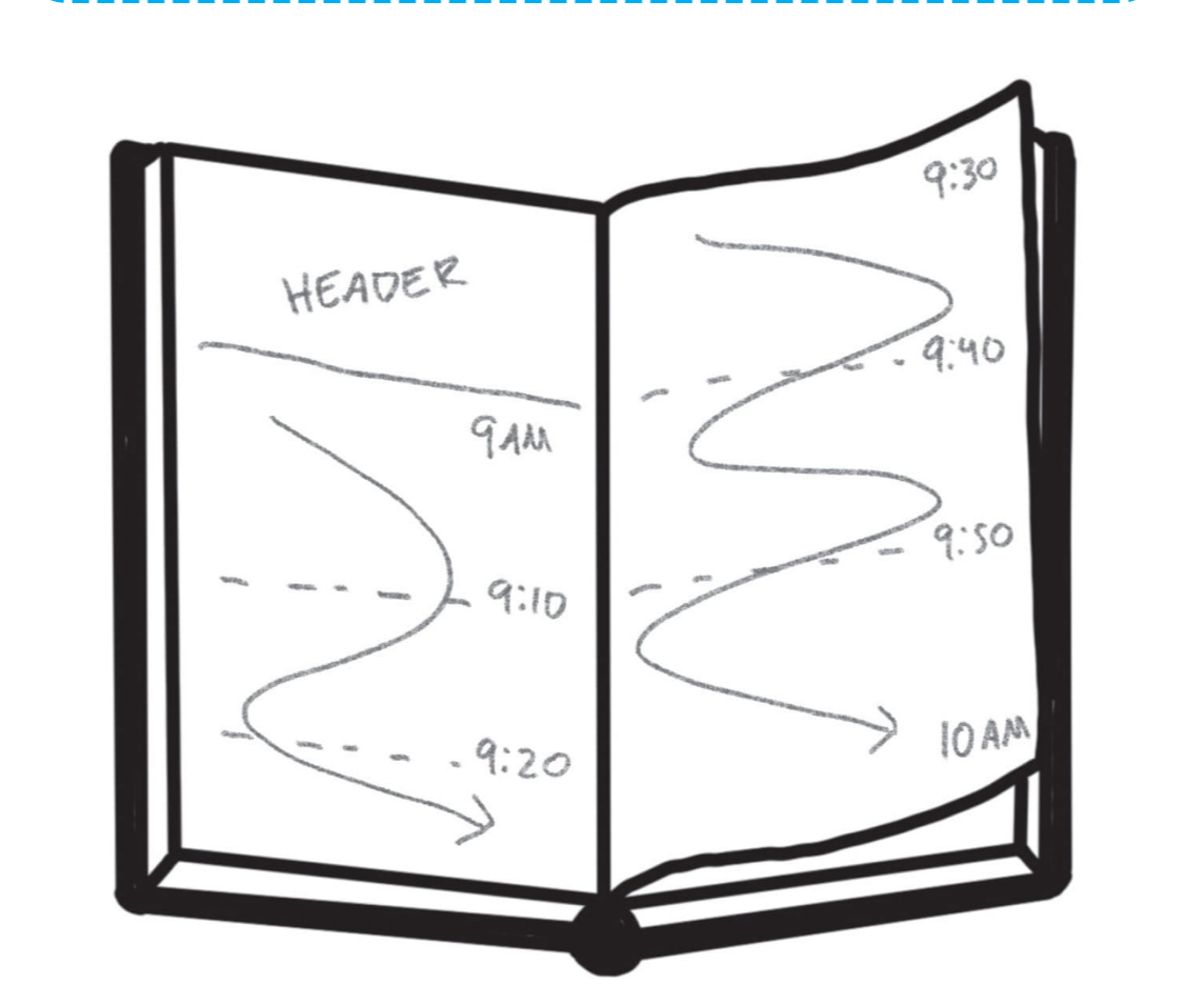
Make the final block biggest, lots of big ideas come at the end.
Practice with 15 minute videos or podcasts!
Headers
Grab attention, like a book cover.
Date, time, presenter, title, key point or promise, pitch. Don't use a ton of space, simple can be good!
Variety of hierarchy and layout, what do you need to convey?
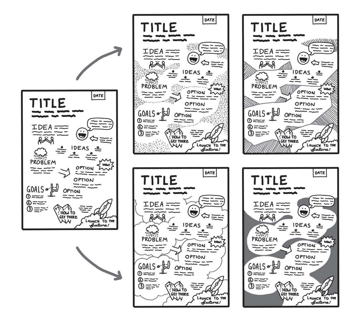
Refinement
Refine IMMEDIATELY after, while it's fresh.
Bold keywords, emphasize words, elaborate if needed.
Add containers, shading, color.
Level up pictures, add arrows and guides. A header if you skipped it.
- If you know you spell words wrong, write the correct spelling in the front of your notebook as a cheat sheet.
- Or start writing the part you know and fill in the rest later.
Content over aesthetic.
High contrast, black and white does this easily.
Balance: Symmetry vs Asymmetry.
Hierarchy / proportions
Unity / Harmony: does everything belong together?
Not samey,, but related and logically connected.
Variety
Be careful to have cohesion.
Limiting colors helps
Rhythm and repetition.
Movement and flow
Keep it simple!
No shame in sharing the beginning of a journey. "I'm trying something new and I want to share it with the world!"
Don't let fear stop you! You only get better by being bad and never stopping.
Don't compare yourself to others!
Sharing lets you compare across time as well.
Learn your style: do you write too big, or take a lot of notes at the beginning? Do you spend your time drawing instead of listening?