The Non-Designer's Book of Design
by Robin Williams
fourth edition
Takeaways
Contrasting typefaces is the basis of all great graphic design.
-
Find the most important element and emphasize it.
-
Group info into logical groups
- Use proximity and space to set them apart and connect them
- Don't use boxes!
-
Find elements you can repeat
-
Add contrast
-
Don't be a wimp
- Use blank space!
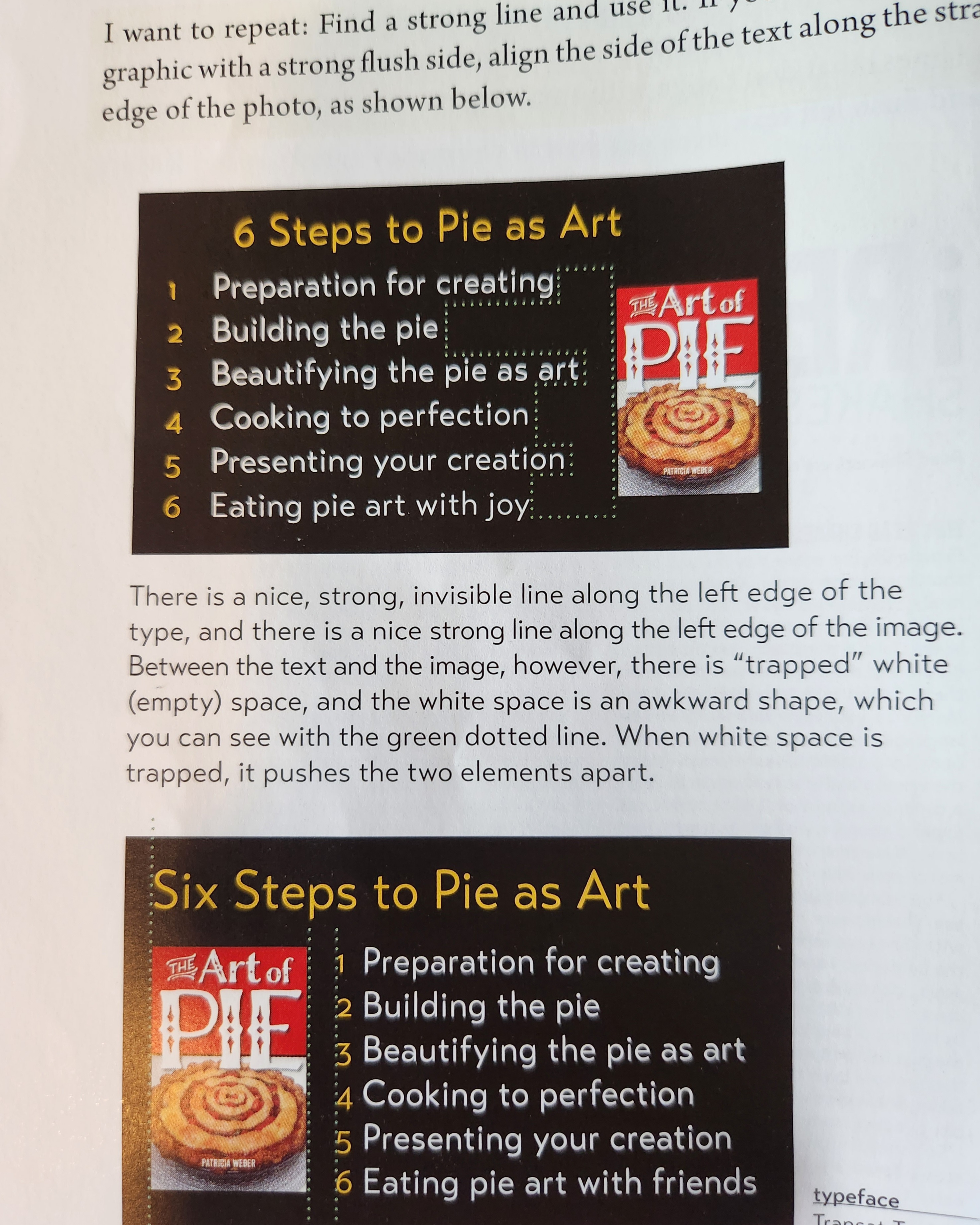
- White space is good, but don't let it become trapped by other elements.
- Be asymmetric, uncenter your format. Be unexpected!
- Make words LARGE or very small
- Make your graphics bold or minimal, as long as it reinforces the whole
- Use blank space!
-
Use EITHER extra space between paragraphs or an intent (one em) but NOT both!
- And never indent the first paragraph!
Overview
Contrast
Clarifies communication, grabs attention.
Avoid elements that are similar.
If they aren't the same, make them very different
Elements:
* Type
* Color
* Size
* Line thickness
* Shape
* Space
* etc.
Repetition
Strengthens unity, develops organization
Repeat elements throughout the piece
Elements:
* Colors
* Shapes
* Textures
* Spatial Relatinships
* Line Thickness
* Fonts
* Sizes
* Graphic concepts
* Etc.
Alignment
Creates a clean and sophisticated look
Nothing should be placed arbitrarily.
Everything should have a visual connection with another element on the page.
Proximity
Helps organize info, reduce clutter, and provide structure.
Items relating to each other should be grouped close together.
When several items are close, they become one visual unit, not several separate ones.
Proximity
White space is your friend. Don't fill up ever corner.
Scattered pieces are less accessible and unorganized.
Group related items together
Move them close so they are seen as one cohevisve group, not a bunch of unrelated bits.
Similarly, items that are NOT related should NOT be close to other elements. This builds organizaiton.
Grouping related things also helps organize the white space
Proximity implies a relationship
Always question whether elements are close to the elements they blong with. Watch for elements with inappropriate relationships.
Decrease leading within one group, use space between different groups.
- Whitespace is good
- Indenting is good
- Keep bullets close to their text
Alignment
Nothing should be placed on the page arbitrarily.
Every time should have a visual connection with something else.
Has to be conscious! Don't just stick things where they fit.
There are 8 ways to set blocks of text copy (source)
- Flush left Ragged right
- Flight Right Ragged left
- Centered
- Justified
- Asymmetrical
- Wraparound
- Image Shape
- Flush center
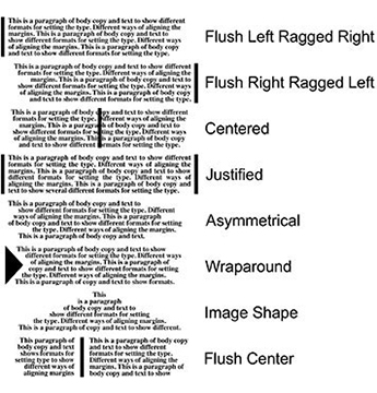
Flush center is good for signs and similar things
Centering Text
❗ Center alignment can appear weak. Prefer left or right. Gives a strong vertical edge.
You can always center the text, but set the centered bit off from the rest.
Centered isn't always bad, but use it consciously.
If you are going to use it, make it look intentional.
Intentional and strong.
If you can't tell instantly that text was centered, don't.
Choose one alignment: Flight left, Flight Right, or Centered.
Mixing and Matching alignments
If you must pick multiple, make sure they still line up.
Learn to draw lines between elements.
For example, having flush right text at the bottom that lines up with the right side of flush left text at the top.
Connecting things
Make sure every item has visual alignment with another item.
- If lines of text are across from one another, align their baselines
- If there are separate blocks of text, align left or right edge
- Align graphic elements' edges to other edges on the page
With intentionality!
Lack of alignment is the biggest cause of unappealing documents!
Never center a headline over flush left body OR over text with an indent.
If the body doesn't have a strong left and right edge, you can't tell the headline is centered, and it looks random.
- Don't indent first paragraphs.
- The purpose of the indent is to tell you there's a new graf. The first one is obvious.
- Indents should be on em (~2 spaces), not 5.
- Align photos with an edge and/or baseline.
❗ Find a strong line and use it.
“Try to make it sound like you wrote it that way on purpose.”
– Arthur Howitzer Jr., the French Dispatch
If your alignment is strong, you can consciously break them, and it will look intentional.
Don't be a wimp. Go all the way or not at all.
❗ You must know what the rule is before you break it
Again, think of the French Dispatch:
One way to tell if a modern artist actually knows what he’s doing is to get him to paint you a horse, or a flower, or a sinking battleship or something that’s actually supposed to look like the thing that it’s actually supposed to look like. Can he do it?
– Julian Cadazio
"The point is, he could paint this beautifully if he wanted, but he thinks this is better."
Repetition
Repeat some aspect of the design throughout the entire piece.
Could be:
- Bold font
- Thick line
- Certain bullet
- Design element
- Color
- Format
- Shape
- Spatial relationship, etc.
- Anything a reader will visually recognize
You already do this a little (consistent heading styles, same bullets, half-inch bottom rule, etc.) but push it further
You want consistency.
My pal Seanonce advised me that each page in a zine should clearly relate to the page before or after. This book goes further: each page in a zine should be clear they belong to the same zine.
See also uniforms (a kind of repetition that demonstrates a relationship)
Start with headlines and subheads; likely already consistent. Make them bold (as in striking, not necessarily as in, you know. Font weight).
Add color , size. Make it a design element, not just a useful one.
If you have consistency, you have have surprises by drawing attention to things that break the consistency.
If nothing is consistent, you can't call attention to anything.
You can add something new (clip art, picture font) just for the sake of repetition.
OR take a simple element and use it in various ways (vary color, angle, size, etc.)
Might not be the same object, but related enough to establish a clear connection.
General: Avoid borders
Make it look intentional, not random.
You can unify multiple pieces by either overlapping them with a design element, or pulling one outside of a border.
Repetition:
- Adds visual interest
- Elevates unity
- Ties together separate parts
1 page useful, multi page critical (consistency)
Go further than you think! Make things more dramatic, stronger, sharper!
Strengthen existing ones or create new ones. Get wild, get zany, have fun!
Beware:
- Don't repeat so much it becomes annoying or overwhelming
Contrast
Be strong, don't wimp out.
Contrast various elements to draw a reader's eye into the page.
If two things aren't exactly the same, make them extremely different.
Contrast helps:
- Draw the eye
- Organize info
- Clarify hierarchy
- Provide focus
- Guide the reader's attention
Create contrast with:
- Large / small font sizes
- Oldstyle font + sans serif font
- Thin / thick lines
- Cool color + warm color
- Smooth + rough texture
- Horizontal element (e.g. long line of text) + Vertical element (tall narrow column of text)
- Widely spaced / closely packed lines
- large / small graphic
If two elements are sort of different but not really, you've made CONFLICT not contrast.
A 14-point font is not that different from a 12-point font. C'mon now.
Neither different enough are black and dark brown or a 1/2 point line and a 1 point line. Be different!
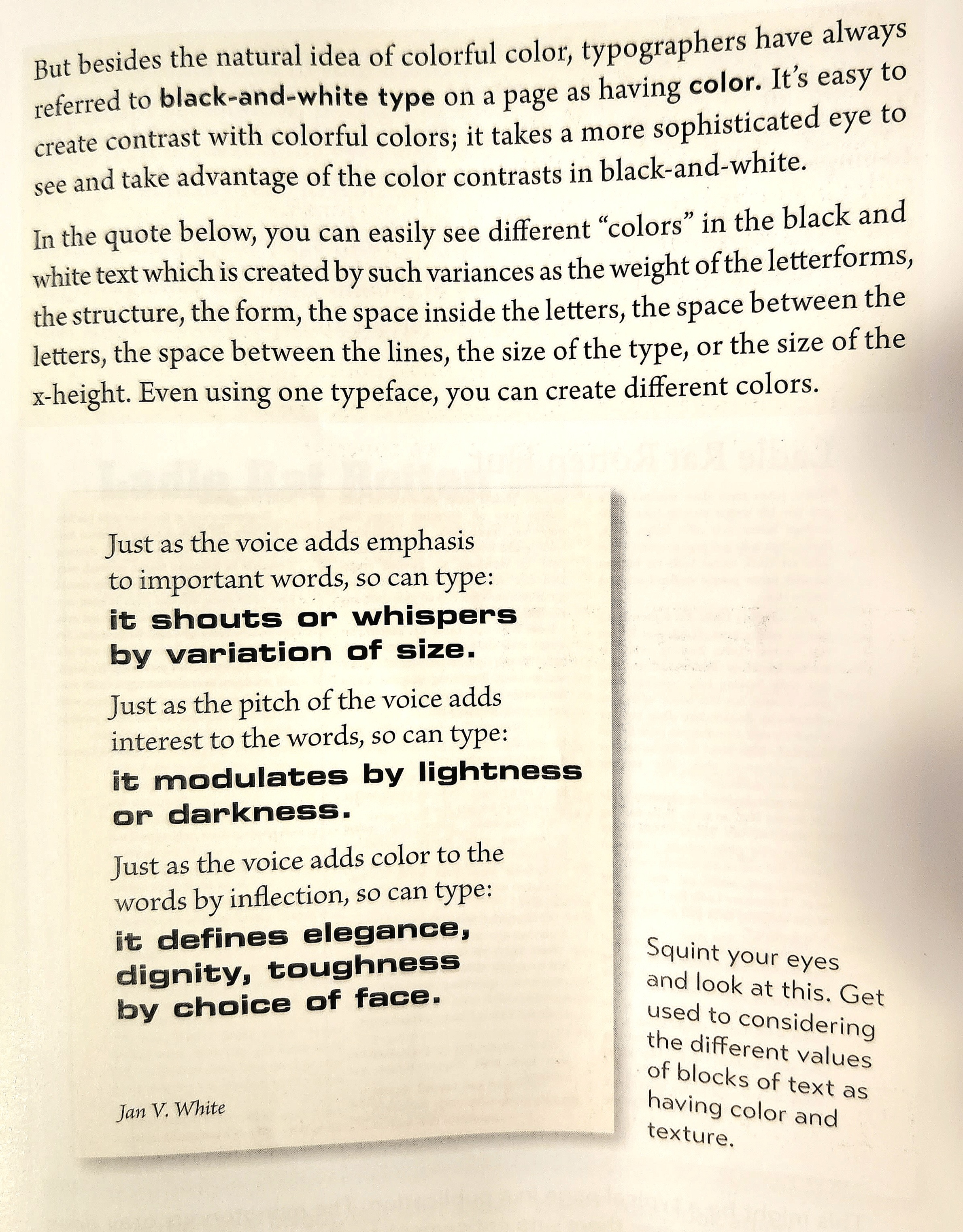
Strong, bold typefaces, alternating caps and lowercase, COLOR.
Alignment: You can use the same alignment (left) without always aligning to the same edge.
Stronger the contrast, less risk of someone thinking it's a mistake.
Again, elements cannot be similar!
Design With Color
Use a color wheel
Complements
Colors on opposite sides are complements. Use one as the main color, one as an accent.
Even if they seem weird (lime green + violet, aqua and red-orange, etc.)
Triads
3 equidistant colors from the wheel form a triad. Red, yellow, blue is the primary triad.
Secondary triad is red-orange, lime-green, bluish-purple.
Can also do orange, green, purple or yellow-orange, aqua, violet.
Split Complement
Choose a color from one side, find its opposite (complement), but instead of the complement, take the colors on either side!
This givers yellow, violet, bluish-purple or green, red-orange, violet.
Analogous colors
Three colors next to each other. This also works!
Yellow-orange, orange, red-orange or aqua, green, lime-green
Shades and Tints
A hue is the pure color. But if you mix in a little black or white, you get a shade or a tint.
❗
- Add black to make a shade
- Add white to make a tint
This can help, for example, avoid Christmas or Halloween vibes of red + green or black + orange.
A monochromatic scheme is a single hue plus any number of corresponding tints and shades.
In software, you get tints by going towards the middle of the color picker circle, and shades by using the darkness slider.
Tones
Tone is brightness, deepness or hue of a color. You want variety here, to keep up contrast.
Warm vs Cool Colors
Cool colors recede, warm colors pop forward.
Use less hot if combining, it's profound. Like spices.
Warm up a color by adding red or yellow, cool down by adding various blues.
Don't try to make them have equal weight! Take advantage of pop and fade to draw eyes where you want them.
CMYK vs RGB
Use CMYK for anything that will be printed, RGB for anything viewed on a screen.
- Edit images in RGB, change to CMYK as the last step
- As your printer (if they aren't a 4-color printing press) whether they prefer RGB or CMYK
Tips and Tricks (designing newspapers, brochures, flyers, letterhead, business cards and more)
- Repetition is critical in branding, even across products. Make a mark.
Business Cards
- Business cards can be vertical, and full color both sides.
- PrintPlace.com is cheap?
- Leave room for notes if you use full bleed on one side: people like to write on them
- Eliminate everything that isn't CRITICAL. It's not a brochure
- Don't label URL, Phone, Email. It's evident.
- Use smaller text size! 9 or 8 or even 7 is great.
Flyers
- You can go wild on flyers.
- Use off-the-wall typefaces
- You're competing for attention here (unlike a business card or letterhead)
- Make headlines and images HUGE Or go minimalist with a single line of tiny text in the middle. Something that makes people notice.
- You can have small body, if you can grab their attention first.
- CONTRAST CONTRAST CONTRAST
- And hierarchy. "If everything is important, nothing is" (that's the plot of the Incredibles).
- Focal point! Strong, contrasting subheads.
- White space is good, but don't let it become "trapped" by other elements.
- Make something you'd like to read. Playful is good! Use color!
Ads
- Keep the copy simple and short
- Headlines are the lifeblood! More important than design
- Use white space! Note where the eyes go!
- Clever, clear, brief.
- Tell them what do do and how to do it.
- Avoid crowding. It's okay to have blank space!
- Contrast! White space does this easily!
- Other ads are so busy yours will stand out
- Small fonts make serifs disappear, especially in print
- Similarly avoid reverse type (white text on dark background) unless you KNOW that your typeface doesn't have thin lines. Ink spreads, yo.
Resumes
If sending digitally, can do a horizontal layout!
Contrast is key! Also alignment, avoid center, tsk tsk.
Keep bullets close to items, keep headings close to related info. Just like always!
Typography
If there's no typefaces, it's not graphic design
❗ Communication is key! Aesthetics come second.
Essential rules
- Use smart quotes
- ONE space after a period
- Punctuation and quotes:
- Periods and commas always go inside the quotes.
- Colons and semicolons go outside
- ? and ! go inside if they're part of the quote, or outside if they don't.
- Multiple quoted paragraphs, " goes at the start of every graf, but only at the end of the final
- Apostrophes are always shaped like a 9, never like a 6 (always "closing" quote, never opening).
- Use -, – and — appropriately. 👍
- em dashes don't use space on either side. can kern some space, but just enough to not bump.
- CAPITAL LETTERS slow down reading speed by having a uniform "coastline" of shape.
- Make sure this is an intentional choice.
- Never underline.
- Bold, larger, different font, color, or combination.
- If you must, use a rule that doesn't bump the descenders of the letters OR make it look intentional.
- Widows are when the last line of a paragraph has fewer than 7 characters. This is bad. WORSE is having part of a word and having the last line be just part of a hyphenated word.
- Orphans are when the last line of a word is at the top of a new column or page. Also bad.
- Adjust tracking or copy to fix both.
Misc
- Punctuation should match. If you have a word that's italic, bold, or in a different font, the following punctuation should be the same style. This applies to bold colons!
- Parens: if the whole parenthetical stands alone, the . goes inside. Otherwise it goes outside.
- Paragraph indents should be one em, not 1/2 an inch, not 5 spaces. One em. —
- Use either space between grafs or an indent, not both.
- Don't indent the first graf.
- If you must set text inside a box., leave much padding.
- Bullets, not hyphens! Or a wingding!
Combining Typefaces
Per Clayton Notestine, the secret to fantastic RPG layout is great Typography (source). He's also said that the #1 trick to great TTRPG visual design is remixing, stealing, and mimicking (source).
3 types of relationship:
- Concordant
- No variety. It's formal, if a bit dull.
- One type family, little variety in style, size, weight, etc.
- Conflicting
- Similar typefaces, not exactly the same.
- Disturbing, like a little contrast but not enough.
- Is it intentional? Who can say.
- Contrasting!
- Bold, brash, great
- Clearly distinct typefaces intentionally mixed.
Concordant
Not bad, just bland and formal. Use some italic, maybe vary the size a little. It works.
This is playing it safe.
Do it consciously.
Conflict
2 or more typefaces that are similar, but not different enough.
You don't want to try to match with something similar. It'll look like a mistake.
The similarities fight.
Avoid always.
Contrast
Fun!
Make it obvious. "Whatever you write, try to make it sound like you wrote it that way on purpose."
- Size
- Weight
- Structure
- Form
- Direction
- Color
It's not the differences that cause problems, it's the similarities!
Don't be a wimp!
Typefaces
Key to combining is to understand similarities and differences.
Broadly 6 categories.
of course there are exceptions. Categories are useful. See also Women Fire And Dangerous Things
- Oldstyle
- Modern
- Slab Serif
- Sans Serif
- Script
- Decorative
- Including Grungy
Oldstyle
Based on scribal handwriting.
Angled Serifs
Diagonal stress
(stress is the line between thinnest parts of curved strokes)
Rarely any distinguishing characteristics.
Good for body copy.
- Times
- Garamond
- Goudy
- Bell
- etc
Modern
Mechanical.
Thin, horizontal serifs.
Radical thick/thin transition
Vertical stress
Cold, elegant
Striking when large.
Headline, not good for body.
- Bodoni
- Didot
- Walbaum
- Modern No. 20
Slab Serif
Little thick/thin transition
Made the thin parts of modern thicker.
Used in advertising.
Very readable
Good for children's books
Darker page, easy to see at a distance.
- New Century Schoolbook
- Memphis
- Clarendon
Sans Serif
No serifs
Often no thin/thick transition; same thickness all around
- Folio
- Modernica Light
- Brandon Grotesque
- Transat Text
Don't use Arial or Helvetica or Verdana, use a sans serif family that includes a strong, heavy, black face. Like those above. They have weights that go from light to extra black.
Eye-catching!
Often used for screens / digital work.
It can be tricky to combine with sans serif fonts, especially those like Optima which have stresses. Why? The similarities!
Thick / thin strokes are similar to serif
Lack of serif looks more like other sans serif.
So be careful if your sans serif fonts have thick/thin transitions (i.e. stresses)!
Script
Look handlettered with calligraphy pen
Lots of subcategories (connect / don't, hand printing, traditional calligraphic, etc.)
Use them sparingly, and never as blocks of text and NEVER NEVER as all caps.
Use them large!
- Peory
- Adorn Bouquet
- Bookeyed Sadie
- Emily Austin
- Thirsty Rough Light
Decorative
NOT for body copy.
Fun, distinctive, whimsical.
Limited use.
- Matchwood
- The Wall
- Horst Scarlett
- Sybil Green
- Flyswim (!)
Go beyond initial impression: if one strikes you as informat, use it in a formal situation. If you get wild west vibes, try it in corporate or flower shops (?)
They can carry emotions, including very different connotations than your first impression. (???)
Great for like instagram style aphorism posts.
In all things, be intentional
Keep your eyes open, and state the problems in words. You can't solve them until you can state them!
Look for things like x-height and descendors!
Start noticing!
Combining Typefaces
All about contrasts:
- Size
- Weight
- Structure
- Form
- Direction
- Color
Contrasts enhance communication AND aesthetics
Size
Don't be a wimp. No 12/14 pt contrast here! That's conflict, baby!
Make things small if no one cares (e.g. volume number on a newspaper)
❗ Can contrast with the page itself: one small line on one big page is compelling.
Again, lowercase is better: it takes up less space, so you can make it bigger. Plus, it's more readable!
Typographic symbols (ampersands, numbers, quote marks) look GREAT when you make them unreasonable large. Use them as decoration!
Can also aid in repetiton!
Weight
Thickness of stroke.
Again, don't be a wimp: regular + semibold? c'mon!
If families are different, probably different weights. Embrace and emphasize it.
Ensure you have at least one very strong black face. Adds visual interest easily!
Don't make it look like a mistake.
Using weights for hierarchy is great in an index or table of contents.
This is also useful if you have a lot of boring text: change key phrases to pop with a strong bold. Tip: combine a bold sans serif within serif body copy. If you do, may have to shrink the bold by a point size so it looks the same size on the page.
Don't do this in a novel! Once again, remember the French Dispatch Rule.
Structure
Imagine fonts built out of material. Sans serif are like built out of tubes, consistent width all throughout. Others switch from thin to thick like tapered fence posts.
When combining typefaces, choose different structures.
Especially easy if you choose different categories.
Emphasize the contrasts.
Switch up size or weight as well.
If you want to use two members of the same typeface, use a light weight and a heavy weight (and also switch up condensed / extended)
Form
Form is about shape (lowercase g is one of the most obvious).
Think about caps vs lowercase, that's a different form of the same material.
So is roman vs italic.
Direction
don't just slant your words. You almost never want it. And especially not to fill a corner.
Slanting up is forward, positive energy. Slanting down is negative energy. But you only want this if it's intentional.
Can be writing up or down (vertical) which is a good effect.
Consider columns of text vs lines of text.
Imagine the contrast of a long headline that spans multiple tall thin columns.
Double down: extended font for headline, tall typeface or extra linespace, narrow columns. Be bold!
Don't forget your strong alignments when you play with this.
Visual texture is important, but hard to put into words.
Color
Warm pop forward, grab attention. Cools recede and don't.
Only a little red creates contrast.
Use BIG areas of cool color, a little red goes a long way.
Small cool + big warm is overpowering
Even black and white (or black and blacker) is contrast of color.
A change in condenseness or boldness can also act as a change in color, even in black and white (see page 210 – 211, not pictured above).
Also play with line spacing.
Robin, like Clayton, suggests printing out twenty blocks of the same text, making minor adjustments to each one in line spacing, kerning, tracking, word spacing, and so on. Clayton made a template for this as well.
Combine the Contrasts
Contrast form AND color, and size and weight and direction and font type. Do an italic or lowercase or something WILD!
Look through magazines, see what they do! It's all about contrast, yo.
❗ Similarities cause problems. Not differences.
Identify the problem, then fix it.
Summary
Size: don't be a wimp
Weight: Heavy + light, not heavy + medium. C'mon. See above re: wimp.
Structure: Choose different font categories.
Form: Caps vs lowercase, roman vs italics. Don't use script + italics.
Direction: Don't type on a slant. Instead mix horizontal and tall.
Color: Not just color. Black too. Warm pops, cool hides. Lotsa cool to offset little warm.
Where to Start?
- Find the focal point. What should readers see first?
- Find your logical groups of info and their relationships. Use proximity for the groups.
- Use your alignments! If you have a strong edge, pair it with alignments of other things (strong edges are photos or vertical lines)
- Create repetition. Can be a shape or bolded typeface or a line or a wingding. If you see something naturally repeated, lean in.
- Add strong contrast!! If everything is flashy, nothing is. Draw the eye!
Things to Lose
- Centered alignment
- The fonts:
- Helvetica
- Times New Roman
- Arial
- Sand
- Boxes and borders