Web Design Patterns You Should Stop Doing
Mouse up on forms
Many websites use fake modals. A modal is a "pop-up" window that takes focus from everything else. Like how you can't click anywhere else in Word while the "save document?" prompt is open.
On websites, they often emulate this by graying out the rest of the screen except for a small window of interaction. If you click outside the modal, it dismisses. Great!
Except
This should only be done on a mouse-up following a mouse-down.
It's VERY easy to accidentally mouse-up outside a window, especially if you're trying to highlight text in a field near the edge of the modal.
If you are going to dismiss the window and discard user data, either listen for a mouse down AND a mouse up outside the window OR prompt the user to save.
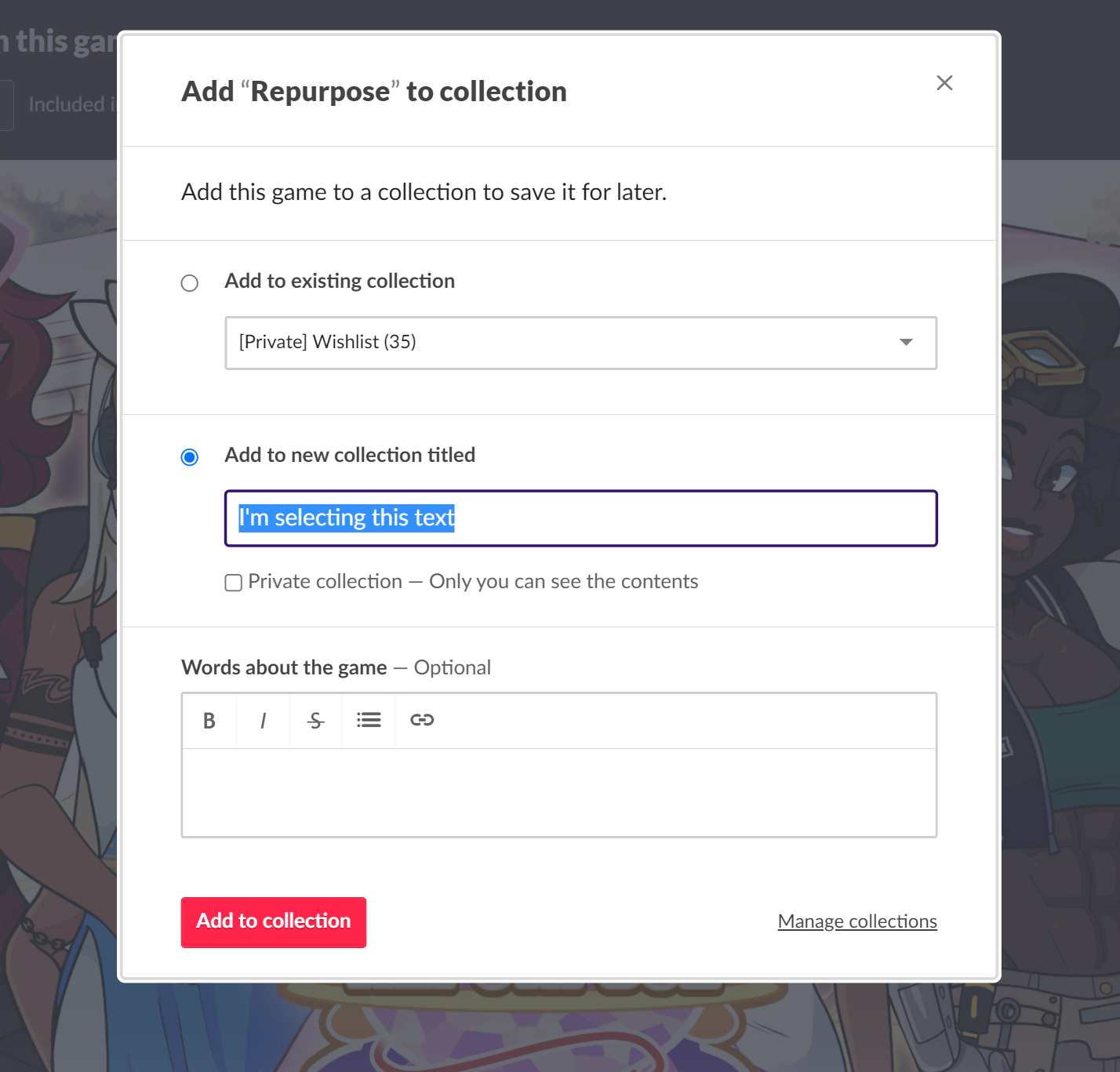
*This example isn't * wholly terrible because the text is pretty far from the edge. Good job! But if there was less padding to the left of the selected text, and a user selects from right-to-left, it's very easy for the mouse to exit the window before mousing up.
At the very least, if you must do this, include proper padding like the example above.
Verification Codes
If you text a user a one-time verification code, like 12839, you should also trim spaces from the user's input.
If someone copy/pastes 12839 , you should still accept it, even if it's not exactly 12839. A single space should not cause verification to fail.
Birthday Date Pickers
When you let the user pick their DOB, don't use a date picker box. If you DO use a date picker, don't set it to today's date.
Let the user type in their date of birth in a text field. You can validate it or restrict it, but please don't force them to click arrows dozens of times to get to the right year.
Better yet, use a dropdown for the year and then set the date picker.
Login pages should default to login, NOT to register
Users will register for your website one (1) time. They will log in at least one time. Prioritizing new users over existing ones makes the experience good for everyone person once and worse for the people actually using your site.
Prioritize the people using your website, not newcomers. The extra button click doesn't matter once, but it gets real annoying in the long term
Respect Ctrl+K to insert a hyperlink
It's a common pattern! If you don't respect it, the browser will treat it like ctrl+L and take over the browser box. Not what users expect!